The Rule of Thirds
Estimated reading time: 10 minutes
Table of contents
- The Basics of The Rule Of Thirds
- How To Use The Rule of Thirds
- Using The Rule of Thirds in Landscapes
- Creating And Controlling A Sense Of Motion
- Using The Rule of Thirds to Emphasize Space And Help Tell A Story
- Using the Rule of Thirds in Portraits
- When Not to Use The Rule of Thirds – And How To Use It After the Shoot
- A Valuable Guideline To Be Used With Creative Discretion
- LATEST POST
- RELATED LINK
Following the Rule of Thirds, a simple and easy-to-use composition technique that can increase viewer engagement, maximize visual impact, and transform your images from good to great, could be the key to taking your photography to the next level.
Based on how the human eye naturally moves and focuses when viewing an image, the Rule of Thirds provides a method for consistently creating balanced, visually pleasing photographic compositions.
Though the principle has been used by artists throughout history, it was first described and named by painter, author, and engraver John Thomas Smith in the 18th century. Since then, the Rule of Thirds has become one of the most well-known and widely used photographic techniques.
The Basics of The Rule Of Thirds
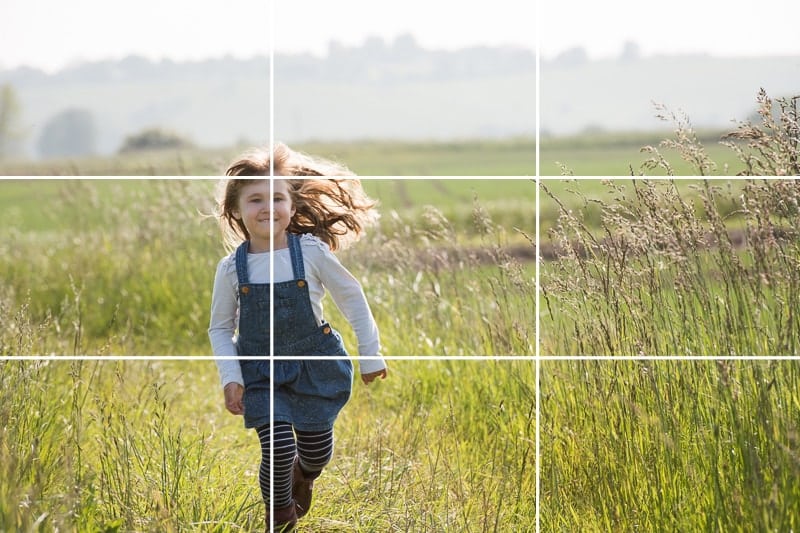
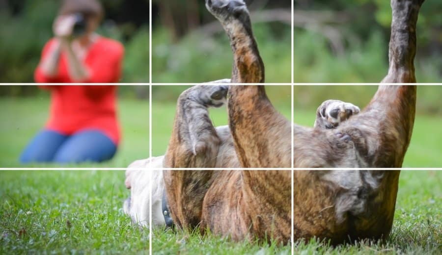
The Rule of Thirds divides an image into a symmetrical 3 x 3 grid, similar to a tic tac toe board, with two equally spaced vertical lines intersecting with two equally spaced horizontal lines. Visualizing the grid overlaying your image may be difficult at first, but it quickly becomes automatic and effortless as you use the Rule of Thirds to compose images on a regular basis.
In some cases, your camera can do the visualizing for you; many digital cameras have a handy built-in feature that allows the photographer to see the grid through the viewfinder.
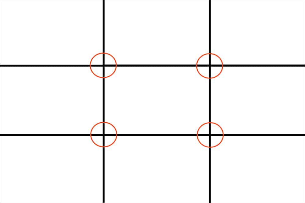
This grid serves as the framework for positioning the subject and objects of interest. The four points where the lines intersect are the most powerful focal points, while the lines themselves are the second most powerful focal points.
The theory behind the rule is that placing objects of interest on intersection points or along lines rather than in the center of the image will not only create a more balanced and visually appealing image but will also allow viewers to interact with the image more naturally; studies have shown that most people naturally focus first on one of the intersection points rather than in the center of the image.
When you use the Rule of Thirds to compose your photographs, you ensure that viewers are drawn to your subject without distraction or visual confusion. Furthermore, aligning horizontal or vertical lines within the image to the grid lines can significantly improve visual impact and allow the eye to naturally travel around the image. This is especially important in landscapes, seascapes, and other images with a clear horizon line.
Using the Rule of Thirds to compose your images not only consistently produces photos that work with, rather than against, the way we naturally focus, but it can also add interest and help you tell your story by giving your images a sense of movement, energy, and direction.
How To Use The Rule of Thirds
Once you’ve identified the points of interest in your photo, begin by determining which are the most important and work your way around until the key elements are positioned at or near the grid’s strongest intersection points and lines.
The objects in your image do not have to be perfectly aligned to fit on the grid; close will suffice, but the closer, the better. Ideally, the image’s most important point of interest will be aligned with an intersection point.
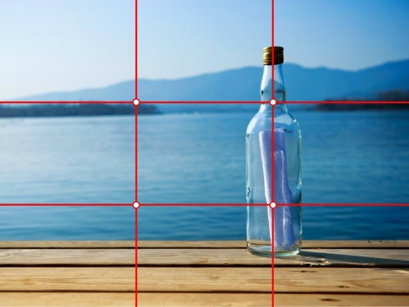
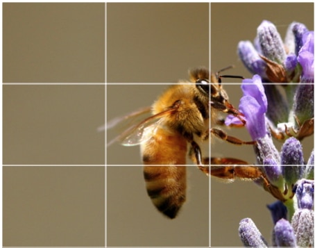
When the subject is the only thing that matters in the image, the upper left intersection or the left-hand line is usually the best bet. When there are multiple points of interest in the image, the lower right intersection is often the strongest.
But rules are made to be broken, and it’s always worth experimenting with a single subject on both grid lines to see which works best with the rest of the photo.
Using The Rule of Thirds in Landscapes
By guiding the viewer’s eye and eliminating visual confusion, the Rule of Thirds can help to clarify the key element in a landscape photograph.
Putting the horizon line in the center of the image effectively cuts the image in half, which can prevent the eye from naturally moving around the entire image.
A centred horizon line can also make it difficult for the viewer to determine which part of the image is the main focus.
Aligning the horizon with one of the horizontal grid lines clearly establishes the subject and creates a sense of flow that allows the viewer’s eye to naturally travel around the image.
Note: If you want to make some adjustments to the photo just let me know. I can do it for you at a very low cost. You can hire me to edit your photo.
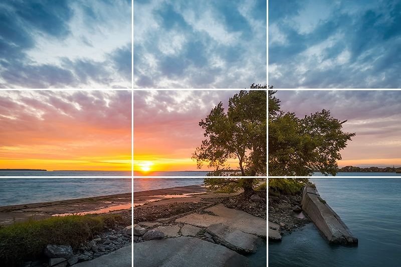
Whether you place the horizon in the top or bottom third of the image will have a significant impact on the relative importance of land (or water, in the case of seascapes) and sky; in general, whichever segment of the image gets more space will be perceived as more important.
Aligning the horizon with the lower horizontal line emphasizes the sky, while aligning the horizon with the upper line emphasizes the sea, land, or structures.
Vertical grid lines are also important in landscape composition. Placing a large object, such as a structure or a tree, in the center of your photograph forces it to compete for the viewer’s attention and focus, which may not be desirable if you’re attempting to capture a beautiful sunset. However, aligning a large object with one of the vertical lines transforms it into an anchor that frames and enhances your subject.
Creating And Controlling A Sense Of Motion
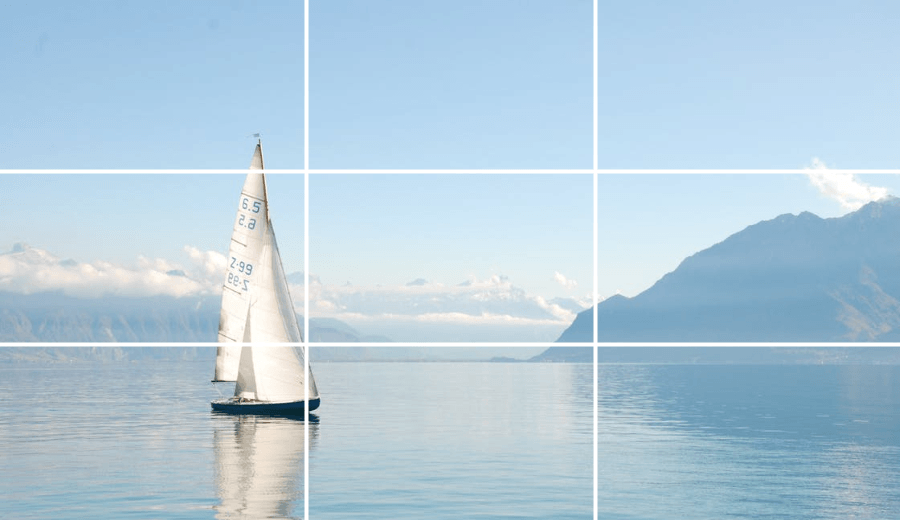
The Rule of Thirds is also useful in developing and maintaining a sense of motion. If you’re shooting a moving object, consider the direction it’s moving and align it so that there’s more space in front of it than behind it.
For example, if you’re photographing a boat sailing to the right, make sure it’s aligned with the left vertical grid line. This gives the impression that it is moving toward the center of the image and automatically draws the viewer’s attention to the image. Aligning a right-moving object with the right vertical grid line creates the illusion that the object is about to vanish, leading the viewer’s eye out of the picture.
Using The Rule of Thirds to Emphasize Space And Help Tell A Story
Using the Rule of Thirds to align the important objects in your image can give the viewer a stronger sense of space and aid in the telling of a story.
The most important object will tend to be brought forward and have more impact if it is placed on an intersection point, whereas secondary objects placed on vertical gridlines will tend to recede while remaining part of the action.
Using the Rule of Thirds in Portraits
The Rule of Thirds can be extremely useful in portrait photography, adding balance, symmetry, and interest, as well as helping to capture the subject’s personality.
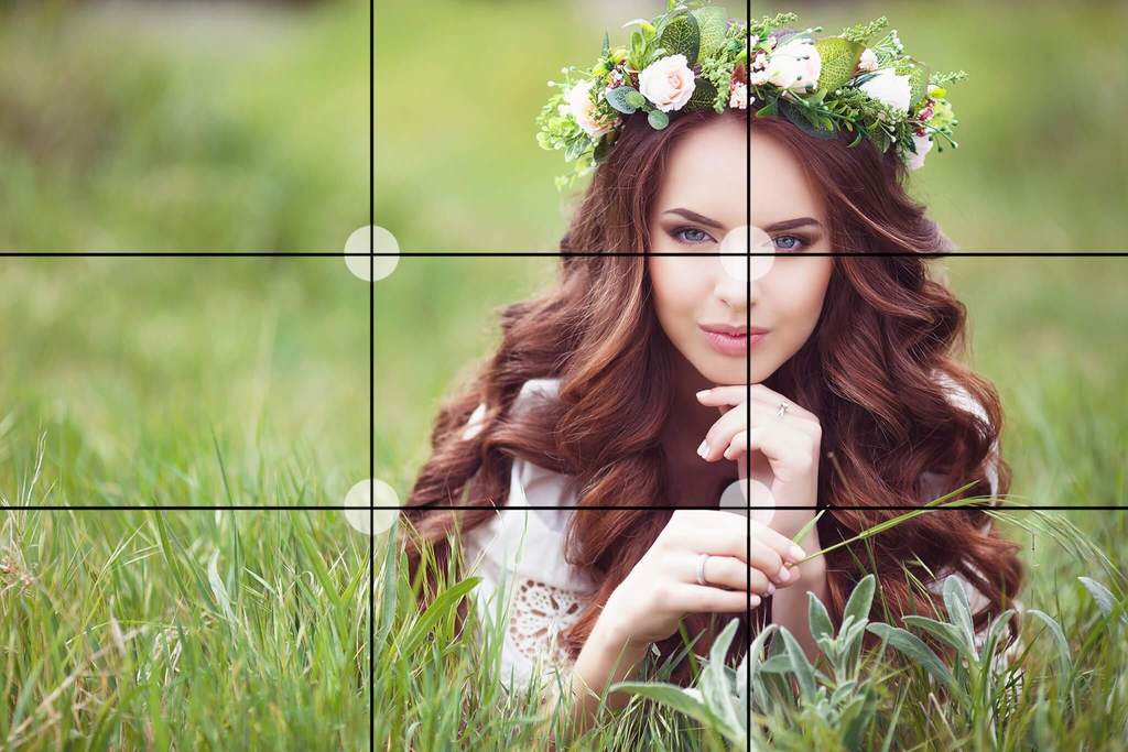
Positioning the subject so that the body is aligned with one of the vertical lines and the eyes are aligned with one of the top intersection points adds interest to the shot and eliminates the “mugshot” effect that sometimes results from center positioning.
Whether you align the subject with the right or left vertical line depends to a great extent on which direction the subject is looking.
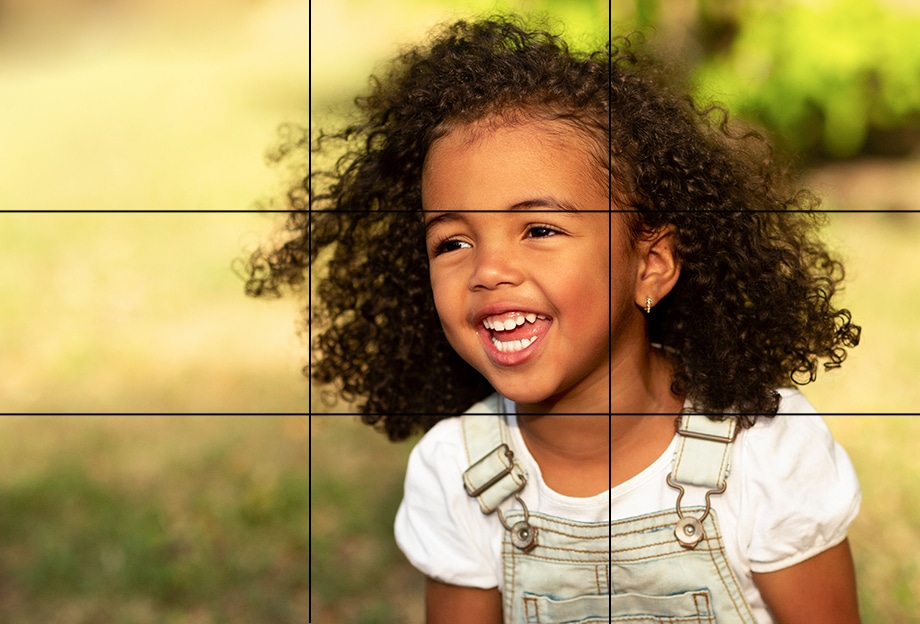
If the subject is looking straight ahead or to the right, aligning the body to the left vertical line with the eyes at the top-left intersection point is usually the most appealing composition, but if the subject is looking left, try aligning the body to the right with the eyes at the right top intersection point.
Aligning the subject with the line opposite the direction they’re looking will draw the viewer’s attention into the image rather than away from it.
If you’re photographing a group, you can align your subjects by using both the upper and lower horizontal grid lines.
When Not to Use The Rule of Thirds – And How To Use It After the Shoot
The Rule of Thirds is a great tool, but it’s not the right choice for every photo.
There are times when employing the Rule of Thirds will undermine or defeat the purpose of your composition. In some cases, centering a subject is the best option; it can help demonstrate a sense of size or space, and it is an effective way to emphasize a subject’s symmetry.
Headshots should be centered horizontally, but the Rule of Thirds grid can be useful for vertical alignment.
Positioning the eyes along the top horizontal line creates a sense of balance and keeps the subject from looking lost in the frame.
If you believe an existing image could benefit from the Rule of Thirds, you can always use your favorite editing software to create a balanced and harmonious composition.
Many popular image editing programs, including Photoshop, include a cropping guide based on the Rule of Thirds.
If your image editor does not support the Rule of Thirds, you can still apply it to an existing image by visualizing the grid over it and cropping it so that the major points of interest are aligned with the grid lines and intersections.
A Valuable Guideline To Be Used With Creative Discretion
The Rule of Thirds is one of the best and most dependable composition techniques, and using it will often result in a stronger, more balanced, and more engaging photograph. But, like all rules, it is designed to be broken when the situation demands it. Consider it a guideline, apply it when necessary, but always rely on your own creative judgment.
Note: If you want to make some adjustments to the photo just let me know. I can do it for you at a very low cost. You can hire me to edit your photo.
LATEST POST
- Wireless TechnologyIxana highlights the advantages of Wireless Technology, noting that Wi-R Technology allows for connections with touch while consuming 100 times less energy than Bluetooth or Wi-Fi, all while supporting wearables that don’t require charging.
- Blaze Transfer and Blaze DriveShare large files safely and quickly with BLAZE Transfer. Effortlessly create links to share and receive files directly from your Drive with coworkers or clients.
- Best on page SEO toolsDiscover the top-rated on-page SEO tools to take your SERP rankings to the next level. Google Search Console, Yoast SEO, and Screaming Frog are some of them in the paid and free on-page SEO tools list!
- Best AI Logo GeneratorsLooka, Logo.com, Logomaster.ai, and Trailer Brands stand out as some of the top AI logo makers, making it simple to design distinctive and high-resolution logos effortlessly.
- Best AI tools for photo editingUnleash your creativity with best AI photo editing tools like Pixlr, Adobe Photoshop, Canva, and Luminar Neo. Edit images flawlessly without quality loss.

